Hello moderator,
this is my A2 Media Studies blog, I hope you enjoy reading through my process of making 'After Dark' teaser trailer, 'After Dark' poster and 'Profilm' magazine cover.
Beneath you can see my final productions completed on the 18th of April 2012.
My evaluation from the 11th March 2012-18th April 2012.
The Research and planning began on the 20th of June 2011-9th March 2012.
Thank you
Keisha ")
Wednesday, 29 February 2012
Research & Planning: IshowU- Magazine edit
Today I have been editing my magazine, I took photographs of a'Oscar' where I then edited this by using the magnetic tool cutting around the shape then placing on my magazine for the strip at the bottom where I will fill up with Oscar picture and a winner picture including text of other winners. Here are the pictures and the IshowU video of the process.
Tuesday, 28 February 2012
Research & Planning: Audience feedback on poster and magazine.
Today I received audience feedback from my class, I handed out a sheet individually where they then could give me truthful answers on the strengths, areas of development and state the genre and narrative. Here is the results.
The results I have found is that all knew it is a horror genre involving a narrative of a a villain (Scarecrow) in the woodland area who is unidentified. They stated that the stengths of my poster and magazine where the editing of the photographs especially in the poster. The areas of development are to look at the text colour as some couldnt read it, slight movements of text as it's not completely accurate to other texts on the page (magazine)
The results I have found is that all knew it is a horror genre involving a narrative of a a villain (Scarecrow) in the woodland area who is unidentified. They stated that the stengths of my poster and magazine where the editing of the photographs especially in the poster. The areas of development are to look at the text colour as some couldnt read it, slight movements of text as it's not completely accurate to other texts on the page (magazine)
Saturday, 25 February 2012
Research & Planning: Update of Teaser Trailer
Today I have been working on the Teaser Trailer After Dark, the new footage has been edited in the montage as it was lacking in shots as we compared it to the Wrong Turn teaser where it included 14 shots within the montage.
Friday, 24 February 2012
Research & Planning: Trailer- Voice Overs
We received our voice overs for our teaser trailer today from the studio in Manchester, I have edited the 'After Dark' and 'Coming Soon' into the trailer and It gives it that professional effect to the trailer and once the score has been added too I think it will give it that final push.
INSERT THE VOICEOVERS HERE
INSERT THE VOICEOVERS HERE
Thursday, 23 February 2012
Thursday, 16 February 2012
Research & Planning: Example of Montage
Tuesday, 14 February 2012
Research and Planning: Poster Update
 |
| After Dark |
Here is my After Dark poster so far, today I added an extra layer so that I could add a dark area at the bottom gradually building lighter, I did thia using the paint brush tool, opacking as I got further up the screen. To be complete now all it needs is a souloutte of the scarecrow on the left hand side, which I will take when I come back after the college break.
Research & Planning: Updated magazine
Today whilst editing my magazine I decided that my old layout wasn't working and didn't seem to work as i thought the medium long shot of the villain didn't suit the horror genre that I was aiming for, therefore decided to manipulate it and make it a close up where I then placed him half on the page, I thought this worked as the photograph was a main focus for the audience, I then used the gradient tool diagonally across the magazine, creating that effect of the scarecrow rising from the dark in match to the film title After Dark. After editing that I was influenced by the bottom banner across the bottom as Empire does, the use of colours grey and red also match my genre and woodland feel.
 |
| New style model. |
 |
| Updated Version |
Friday, 10 February 2012
research and Planning - The newsfootage.
Today we filmed the news footage again, we decided rather than going to the actual location to re-create the scene at a closer location due to time etc. We used our first audition Angela Pearson for the role of the female news reporter as she was confident in the role. We decided to take numerous of takes, to ensure that we had the correct footage to edit.
Thursday, 9 February 2012
Research & Planning: Update of magazine
- Make the masthead larger.
- Fill the open space with more texts.
Wednesday, 8 February 2012
Research & Planning: Plan of the week.
The Magazine Cover
The Trailer
- Make the After Dark font a bigger size to cover the body.
- move the paragraph of fonts at the top right down a little.
- Place the masthead behind the photograph and also make it larger so that its one of the main feature of the magazine.
- Move the bar code to the bottom right corner also create a distribution logo to place next to it.
- Maybe place a box behind the 'EXCLUSIVE'
- I need to take a photograph of the main character, im debating yet to take a long shot of the scarecrow appearing as a 'typical scarecrow' or with the victim and scarecrow.
- Add steel tongs- cast and crew, however I feel that my poster wont benifit from it as much as others, not all posters carry this out as ive seen whilst researching on the internet.
 |
| Example - Cloverfield. |
 |
| Example: The Mist |
 |
| Example: Skyline |
- Add sound thoughout the trailer.
- Record the newsfootage scene outside again.
Tuesday, 7 February 2012
Saturday, 4 February 2012
Research & Planning: Teaser Trailer Feedback
After looking over the feedback sheets, the main points of improvement were re shoot the news report for outdoors, import more shots of the scarecrow before the climax and to add music. Feedback shows that the strength points of the trailer are the jump cuts and title frame with the transitions. Overall by looking at the comments I feel like the selected audience understood the narrative and genre through the micro-elements.
Wednesday, 1 February 2012
Research & Planning: Update of the Film Magaznie
 |
| Adding the photograph onto the magazine. |
 |
| The updated version. |
Research & Planning: Photographs Magazine
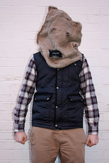
Today I took a couple of photographs of the Scarecrow in three different locations (woodland area, against a white walll and rural area). Some of the photographs I took wasnt very clear or the lighting didnt work, however looking through them I decided to try and edit one and see how it would look on my magazine.
 |
| Medium long shot- Low angle, slight blur. |
 |
| Medium Long Shot- Low Angle- dominating. |
 |
| Mid Shot- Low Angle- powerful. |
 |
| Medium Long Shot- High key lighting tinge of orange across the body. |
 |
| ^ again with a blur. |
 |
| Close Up- Low Angle |
 |
| Long Shot- Low Angle however mise-en-scene not approproiate for the magazine. |
 |
| Medium Long Shot- Low Angle. |
 |
| Medium Shot- good focus with a low angle. |
 |
| Again more in frame though. |
 |
| Meidum Shot- Possibly to much of a low angle. |
 |
| Test shot to see how it would look if he was walking towards the camera, however gives a more action feel. |
 |
| Medium Long Shot- high key lighting. |
 |
| Medium Long Shot- the location wasn't correct, as to the scarecrows posture. |
 |
| Long Shot- high key lighting, tried to create a horror shadow however is dominated by the light. |
 |
| Again however in a Medium Long Shot. |
 |
| Also agazin however from a different angle, however you can see buildings in the background. |
 |
| Medium Shot- High Key Lighting, location not appropriate. |
 |
| Medium shot- High Key Lighting dominated the photograph. |
Today I took a couple of photographs of the Scarecrow in three different locations (woodland area, against a white walll and rural area). Some of the photographs I took wasnt very clear or the lighting didnt work, however looking through them I decided to try and edit one and see how it would look on my magazine.
 |
| Chosen Photograph. |
Research & Planning: Update of the poster
Here is an update of my Poster, I have added names above the title also using the blend tool beneath the writing adding that dark tone to the poster, a conventional horror element.
Research & Planning: Newsfootage
Subscribe to:
Comments (Atom)


