In what ways does your media products use, develop and challenge forms and conventions of real media products?
Use:
* Although challenge the narrative we also use some structure to Todorov’s narrative theory as we have a equilibrium, peaks and troughs and a disruption with a new equilibrium, however not a climax as we don’t want to tell too much of the narrative away as it is a teaser trailer.
Develop:
*For the score we was influenced by Wrong Turn, however we developed the sound by adding another instrument to add more tension as they had sound effects of the car crashing, we felt that the added sound help build up to the fast paced montage that was leading to the climax.
Challenge:
*We challenged Todorov’s narrative theory as we placed our recognition of disruption before the actual disruption, as we see the newsreader stating the teenagers have gone missing before the fast paced montage of them being attacked by the villain.
*The story line felt unique in the sense of the villain been a scarecrow, also the narrative left the audience questioning, especially towards the end of the film included Carol Clover’s final girl theory.
Film Poster:
Use:
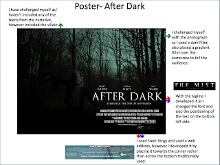
* I have used influence from majority of film posters to use the SteelTongs font, this is part of the marketing tool and to inform the audience who the cast & crew is of the film.
Develop:
*I developed the convention of slug-line beneath the film title 'After Dark', I used 'remember the 5th of November' where it was a play on words that links very nicely with the narrative and the celebration of guy falks.
* With the genre of my film I have developed the style of the poster, by using a blue filter for the woodland background I feel like I have challenged the horror genre. With the use of gradient overlay too I feel like the narrative is been shown, especially through the antagonist.
Challenge:
*The positioning of the villain was challenged, at the start of the year we did ancillary task where we was given a task to produce a draft poster for a film, I used that as an influence and produced my poster around that.
Film Magainze:
Use:
I have first of all used the conventions of a film magazine, influenced by film magazines such as 'Total Film' for example:
*Use of Barcode located on the right hand side beneath the masthead.
*The use of 3 colour theme of red,grey and black.
*The masthead 'PROFILM' located at the top of the page being the largest text on magazine so that an audience could recognize it, also an advertisement tool.
*Conventional use of price, issue number and date informing the target audience.
Develop:
*Although I'm using the structure of the text in some areas I have developed it by using a different style font and size as the one from the real media text did not fit my genre of horror.
Developed the masthead, by using a different font and colour than an existing one from 'Empire'.
Developed the masthead, by using a different font and colour than an existing one from 'Empire'.
Challenge:
*Although the shot type is similar I decided to Use the Villain on the cover rather than the victim, which could be viewed as quite unconventional, also using this character was challenging as you cant detect emotion due to the Mise-en-scene.
*Using the gradient tool over the photograph was a challenge, however it gives the magazine that sense of dark mystery around the villain.


No comments:
Post a Comment